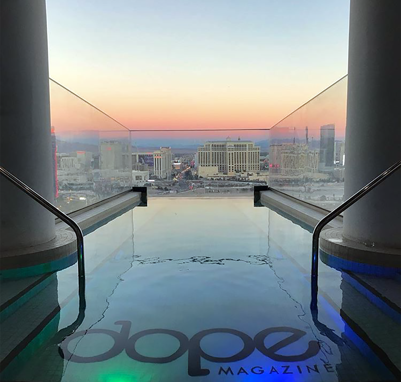
Brandon Palma, alias 8TH DAY CREATE® held the title of Graphic Design / Art Director at Dope Magazine from 2011-2012 and 2015-2017.
Dope Magazine was a print publication based in Seattle, WA that ran from August 2011 through Summer 2018. From its inception, Brandon Palma shaped its look, creative feel and intent with an intelligent, design-forward approach celebrating the timelessness of cannabis throughout history.
Under this creative stewardship and creative influence in the publication, apparel, and branding side of the business in the years 2011-2012 and in 2015-2016, DOPE MAGAZINE® grew rapidly and earned national recognition, including recognition by INC. MAGAZINE® as one of the top 5000 fastest-growing private companies in 2016, ranking an esteemed #12 in Top Media Companies, and #18 for Top Seattle, WA Private Business Start-ups. The magazine also achieved position #674 in 2017 and position #887 in 2018.
More than a publication, it became a design-led platform for cannabis culture — intelligent at its core, unmistakable in market, and built to be worn, collected, and remembered.
THE BRAND NAME & LOGO DESIGN
In Summer 2011, the original co-founders — David Tran, James Zachodni, Evan Carter, Trek Manzoni, and Nate Chrysler — commissioned Brandon, founder of 8th Day Create®, to originate the trade name, logo, brand system, art direction, style guide, and publication design. The debut issue and brand premiere launched at Seattle Hempfest 2011.
Naming began with an expansive slate of candidates sketched across a giant sheet of paper, then distilled through rigorous presentation to investors and co-owners. The result became DOPE MAGAZINE®, with DOPE defined as “Defending Our Patient’s Everywhere” — later refined to “Defending Our Plant Everywhere” around late 2015. The acronym concept was contributed by co-founder Trek Manzoni.
The logo’s industrial-playful logic was intentional: each letter was imagined as a workable bong component, smokable glass forms that could separate and connect. This gave the mark a memorable silhouette, cultural wit, and a modular geometry that translated across print, digital, events, and merchandise.
A full rebrand in 2015–2016 tightened typography, grid systems, and color, aligning the identity with the magazine’s maturing voice while preserving the bold clarity of the original mark. There was also a slight update to the logo.


PRINT PUBLICATION COVER DESIGNS
2011, 2015, 2016
As founding creative director, Brandon established the publication and cover designs for the first ten issues, treating cannabis with the same visual discipline afforded to culture and fashion titles. Clean typographic hierarchies, purposeful grids, and cover compositions positioned the magazine as a serious voice in a rapidly emerging market. The 2015–2016 refinement further elevated cover treatments and interior systems, enabling consistent scale as the magazine expanded throughout Washington, Oregon, Colorado, California, Nevada, Arizona, and ultimately national distribution.
APPAREL DESIGNS
To accompany the printed publication and expand our visual footprint and impact at events and businesses, a seasonal capsule collection was designed. My overall inspirations behind the designs were to bring a cohesive branded experience while celebrating the cannabis plant and the culture in fun unique ways.
Collection No. 1 - Summer 2011 Capsule Collection (featured below)
These 3 designs established the brand through apparel while also featuring a design that flips the well known D.A.R.E. design.
Spring 2012 Capsule Collection (featured below)
was created in alignment with the publication's very first 420 public event. The designs were brand focused with a special edition "420" design in Roman numerals.
Spring/Summer 2015 Capsule Collection ( featured below)
This 10 apparel design collection featured 6 typography designs alongside 4 state/city inspired designs (one for each state the magazine was in at the time).

